For the event Love Newport Beach, we had the opportunity to create a logo and branding that would resonate with the local community and capture the essence of the event. After the inaugural year, we were tasked with redefining the brand to visually align it with its sister event, Love Costa Mesa, which takes place on the same day.
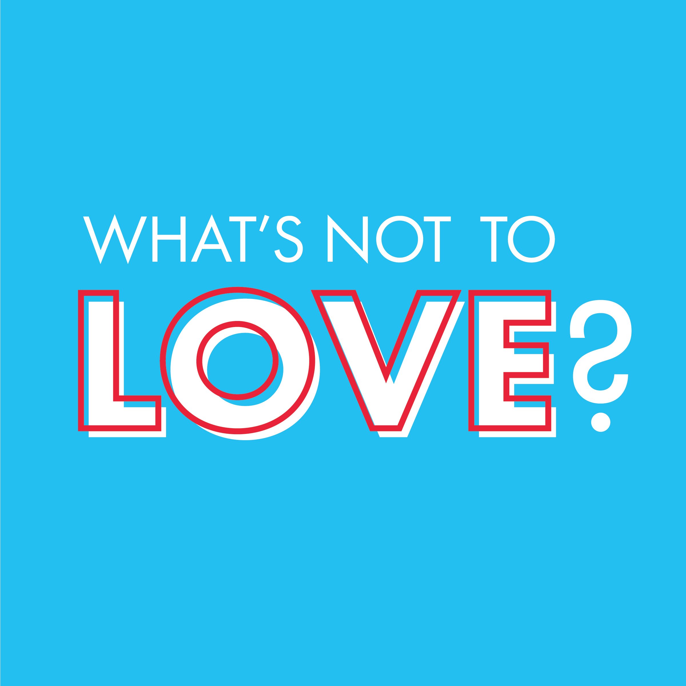
In the rebranding process, we focused on creating a cohesive visual identity that would seamlessly tie both events together while preserving their unique local flavors. The logo and overall branding for Love Newport Beach were designed to be fun and vibrant, reflecting the energetic and beachy spirit of the community. The typography was chosen for its clarity and readability, ensuring that all signage, whether viewed up close or from a distance, would be easy to read and instantly recognizable.
One of the key considerations was making the branding evergreen. we aimed for a timeless design that could be used year after year, maintaining its relevance and appeal without needing significant updates. This involved selecting colors and design elements that were both modern and classic, ensuring longevity and consistency across all promotional materials.
The result was a refreshed brand identity that not only visually connected Love Newport Beach with Love Costa Mesa but also stood out in its own right. The new branding successfully communicated the fun and inclusive nature of the event, making it accessible and inviting to everyone. By redefining the brand, we helped establish a strong, unified visual presence for both events, enhancing their recognition and impact within the community.